Vector versus raster, in plain words
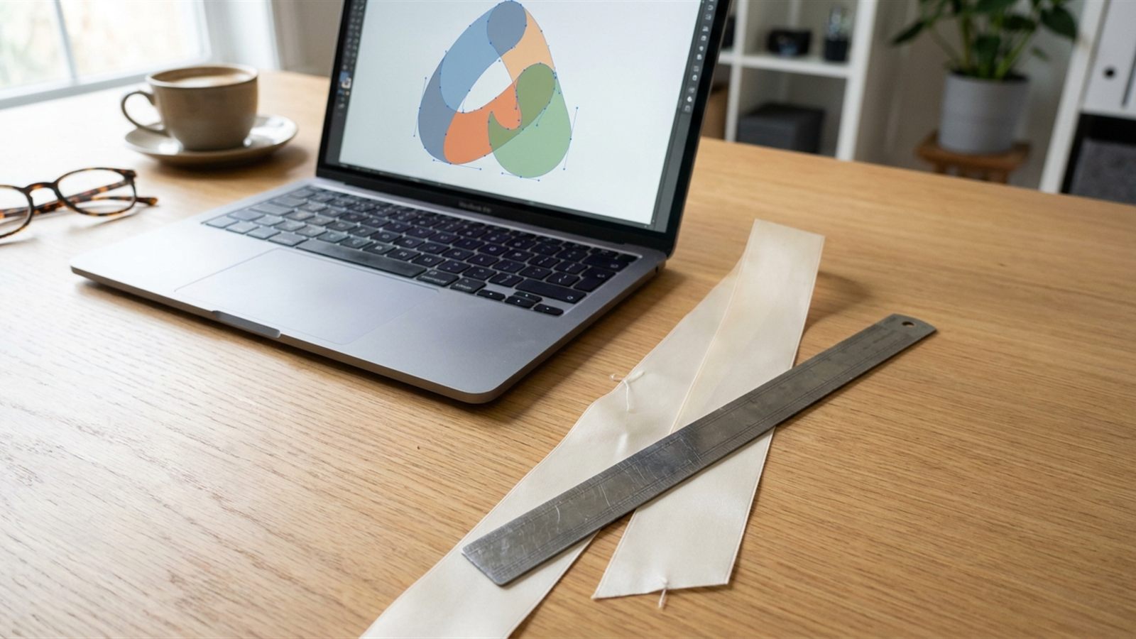
A raster file, such as a JPG or PNG, is a grid of coloured dots fixed at one size. Stretch it bigger and the dots stretch with it, so edges turn soft and blurry. A vector file is built from mathematical lines and curves, so it can be scaled to any size, tiny or huge, and the edges stay sharp. Ribbon printing works from the outline of your logo, so it needs a vector file.
This is why a logo pulled from a website is too small to print well. A website logo is almost always a raster image, saved small so a web page loads quickly, and it was never meant to be enlarged onto a metre of ribbon. The logo-printed ribbon guide covers the same point: a logo pasted into a Word file or saved as a small JPG will print with soft, blurry edges.
The file types to send
Send one of these, in order of how commonly printers ask for them:
- AI (Adobe Illustrator): the native vector format most design software opens.
- EPS: an older vector format, still widely used for print.
- PDF: vector if it was saved from design software rather than scanned; most logo PDFs are fine.
- SVG: a vector format built for the web, and readable by most design software too.
If you only have a JPG or PNG, say so before you send anything. A designer can often redraw a logo as vector art from a clean, reasonably sized raster copy, but a blurry, tiny or heavily compressed image may not give them enough to work from. Redrawing takes time and is worth asking about separately, rather than being assumed.
Outlines, and why they matter
If your logo includes text, have it converted to outlines before you send the file. Outlining turns the letters into plain shapes, the same way the rest of the logo already is, so the printer does not need your fonts and nothing reflows if a font is missing on their end. The logo-printed ribbon guide states this plainly: "Text converted to outlines, so the printer does not need your fonts and nothing reflows." Once text is outlined it can no longer be edited as text, so keep an editable master file of your own and send the outlined copy for printing.
A single-colour version
Many ribbon print methods lay down one solid colour per pass, so a logo built from gradients, shadows or tints usually needs a simplified version with each shape reduced to a flat colour. Prepare this alongside your main artwork rather than leaving it to be worked out at the last minute. If your logo already uses two or three flat colours, say which parts can drop to one colour if the method needs it.
The printable band inside the width
The ribbon's width is the height limit for anything printed on it, and a margin is needed at the top and bottom edge so nothing runs off when the ribbon twists into a bow. How much margin is needed varies by printer and by width, so ask for the printable height on your chosen ribbon rather than assuming a fixed figure. The ribbon width guide sets out the full range of widths and what each one is typically used for, which is the starting point for working out whether your logo will fit comfortably or needs simplifying.
The repeat
A printed ribbon does not carry one logo; it carries the same logo printed over and over along its length, called the repeat. Three things to decide:
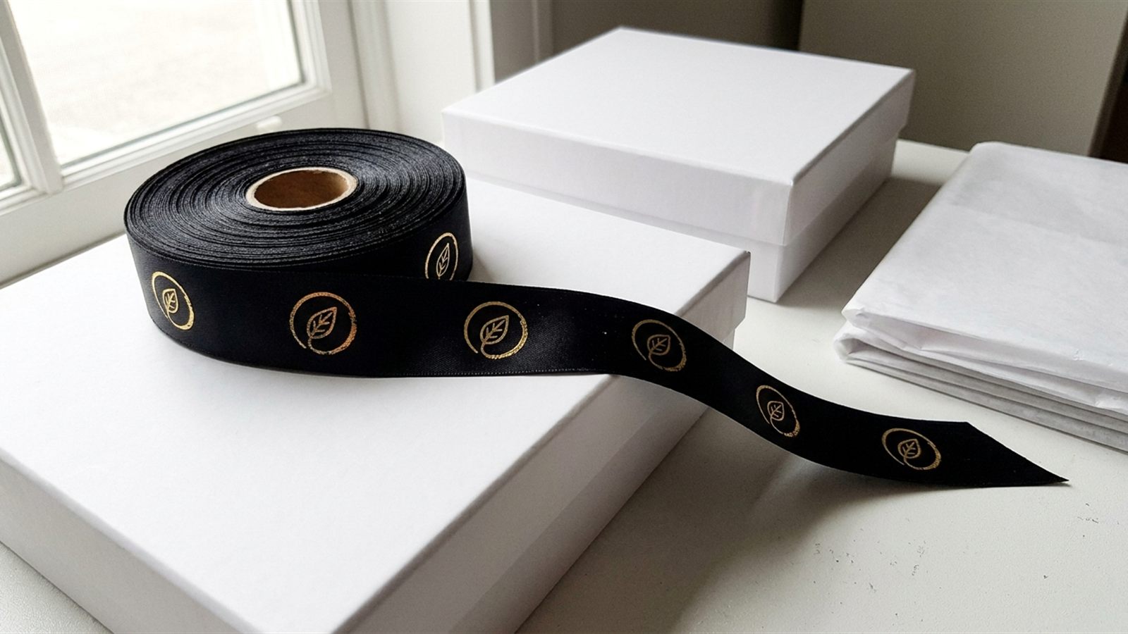
- Direction: the logo normally reads along the length of the ribbon, the way it will be seen when the ribbon lies flat or is wrapped around a box.
- Spacing: the gap from one logo to the next. Too close and it reads as a busy pattern rather than a mark; too far apart and a short length, such as a bow loop, may show no logo at all.
- What happens at a bow: when the ribbon is tied, only part of the repeat shows on the front of each loop. Tie a sample bow from plain ribbon, mark where the logo would fall, and check that at least one complete logo sits on the front before fixing the spacing.
Minimum stroke and text size
Printing onto ribbon cannot hold the same fine detail as printing onto paper. Very fine hairlines and small detail fill in or drop out, especially in foil and screen printing, so thin strokes need to be thickened and small text needs to be enlarged in the artwork before it is sent. There is no single point size that works on every ribbon, since it depends on the width, the finish and the print method, so treat any fine detail as something to test on a sample rather than something to guess at.
How to label colours
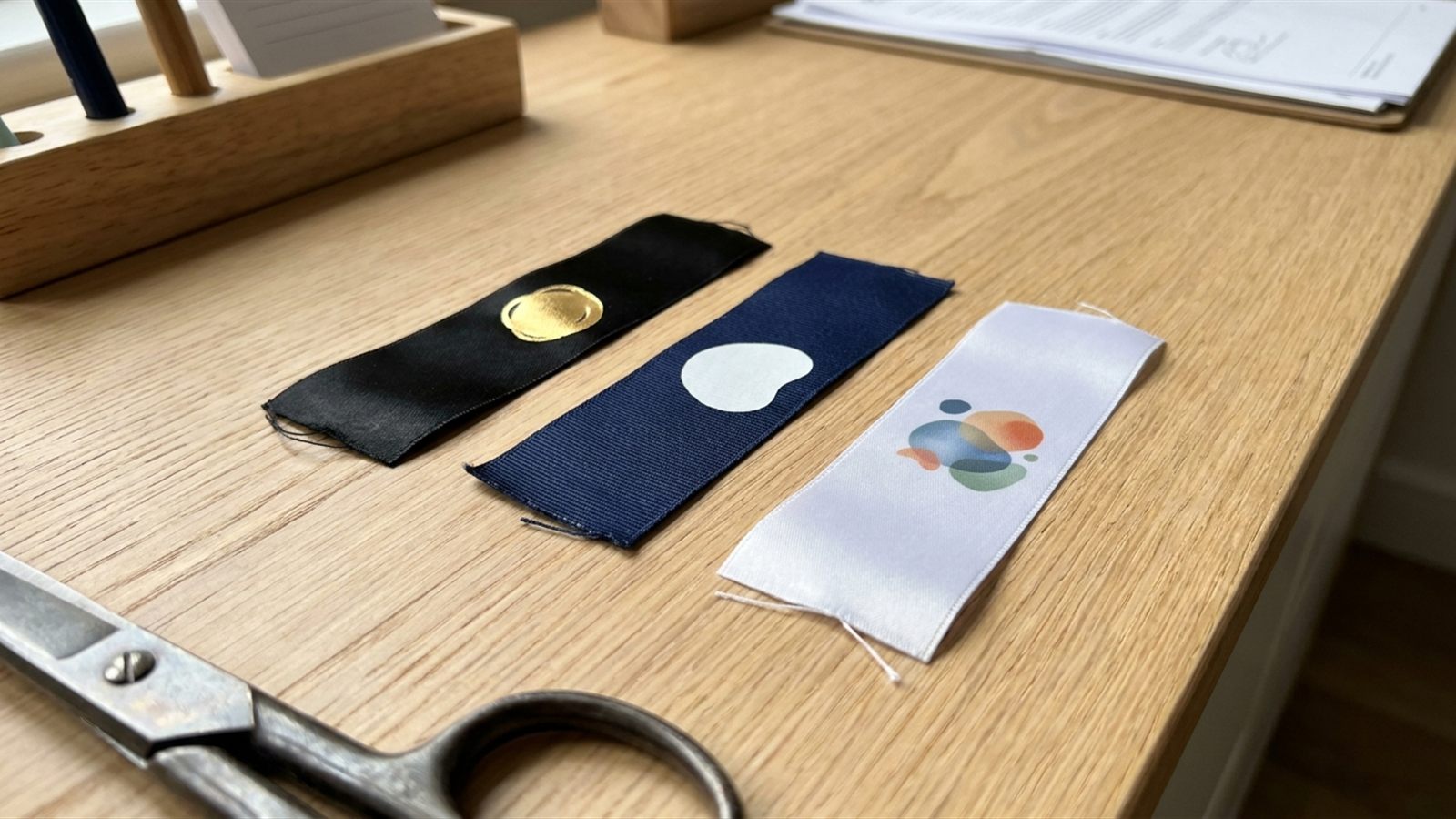
Name every colour rather than describing it. For printed ink or dye-based colour, give the Pantone reference rather than writing "navy" or "our green", since the same word means something different on every screen. For foil, name the foil colour (for example, gold or silver) rather than a Pantone number, because foil is a metallic material rather than a mixed ink and is chosen from the printer's own foil range. The logo-printed ribbon guide makes the same point: "Each colour named, ideally by its Pantone number. 'Our green' means something different on every screen."
What a proof is, and how to read one
A proof is a preview of your artwork as it will sit on the ribbon, sent for you to check before the full run is printed. Read it for the same things every time: the logo direction, the spelling and the outlines of any text, the colours named correctly, the size against the ribbon width, and the repeat and spacing. A digital proof confirms layout and spelling; it does not confirm exact colour, since colour on screen and colour on ribbon are not the same thing. For a first order, or any order with a colour that matters, ask about a printed sample on the real ribbon as well as the digital proof.
Pre-send checklist
| Check | Why |
|---|---|
| File is AI, EPS, PDF or SVG | Vector art scales cleanly; raster art blurs |
| Text converted to outlines | No missing fonts, nothing reflows |
| A single-colour version included | Many print methods print one colour per pass |
| Each colour named (Pantone, or foil colour by name) | A described colour reads differently on every screen |
| Logo sized to fit the printable band on your ribbon width | Width is the height limit, with a margin each side |
| Fine strokes and small text thickened or enlarged | Fine detail fills in or drops out when printed |
| Repeat and direction decided, tested on a tied bow | A bow shows only part of the repeating length |
| Proof requested, and a printed sample for a first order | Screen colour and ribbon colour are not the same thing |
None of this replaces the general order checklist in the logo-printed ribbon guide or the print method comparison in the guide to foil, screen and digital printing. This page is the artwork file itself; those cover choosing a method and planning the order around it.
Questions buyers ask
Can I send a PNG or JPG logo for ribbon printing?
Not as the final file: ribbon printing needs a vector file such as AI, EPS, PDF or SVG, because a raster image like a PNG or JPG is a fixed grid of dots that turns soft and blurry when enlarged. A logo pulled from a website is a raster file saved small for a web page, which is why it is too small to print well. If a vector file does not exist, say so before sending anything, since redrawing a raster logo as vector art is a separate step.
Why does my logo text need to be converted to outlines?
Outlining turns letters into plain shapes rather than live, editable text, so the printer does not need your fonts installed and nothing reflows if a font is missing on their system. It is the same reasoning as the rest of a vector logo: a fixed, printable shape rather than something that depends on software settings. Keep an editable master file for your own records and send the outlined copy for printing.
Why do I need a single-colour version of my logo?
Many ribbon print methods, such as hot foil and screen print, lay down one solid colour per pass rather than blending colours the way a digital printer can. A logo built from gradients, shadows or tints needs a simplified, flat-colour version prepared in advance, so the printer is not working it out under time pressure. Having it ready alongside your main artwork also makes it easier to compare print methods for your logo.
How much margin does my logo need inside the ribbon width?
Some margin top and bottom, so the print never runs to the very edge and off the ribbon when it twists into a bow. How much varies by printer and by width, so there is no single figure to design to; ask for the printable height on the specific ribbon width you are using. The ribbon width guide sets out the standard widths this margin sits inside.
What is the "repeat" on printed ribbon?
The repeat is the pattern of your logo printed again and again along the length of the ribbon, with a decided spacing between each one. Too tight a spacing reads as a busy pattern rather than a mark; too loose and a short length, such as one loop of a bow, may show no logo at all. Tie a sample bow from plain ribbon and mark where the logo would fall before fixing the spacing.
How should I name colours in my artwork file?
Name printed ink colours by their Pantone reference rather than a description such as "navy", since a word means something different on every screen. Foil colours are named by the foil itself, such as gold or silver, because foil is a metallic material chosen from the printer's own range rather than a mixed ink. Naming every colour this way also makes a re-order easier to match later.
What is a proof, and what should I check on it?
A proof is a preview of your artwork laid out on the ribbon, sent for you to check before the full run is printed. Check the logo's direction, the spelling and outlines of any text, the colours named correctly, the size against the ribbon width, and the repeat and spacing. A digital proof confirms layout, not exact colour, so ask about a printed sample on the real ribbon too, especially for a first order.