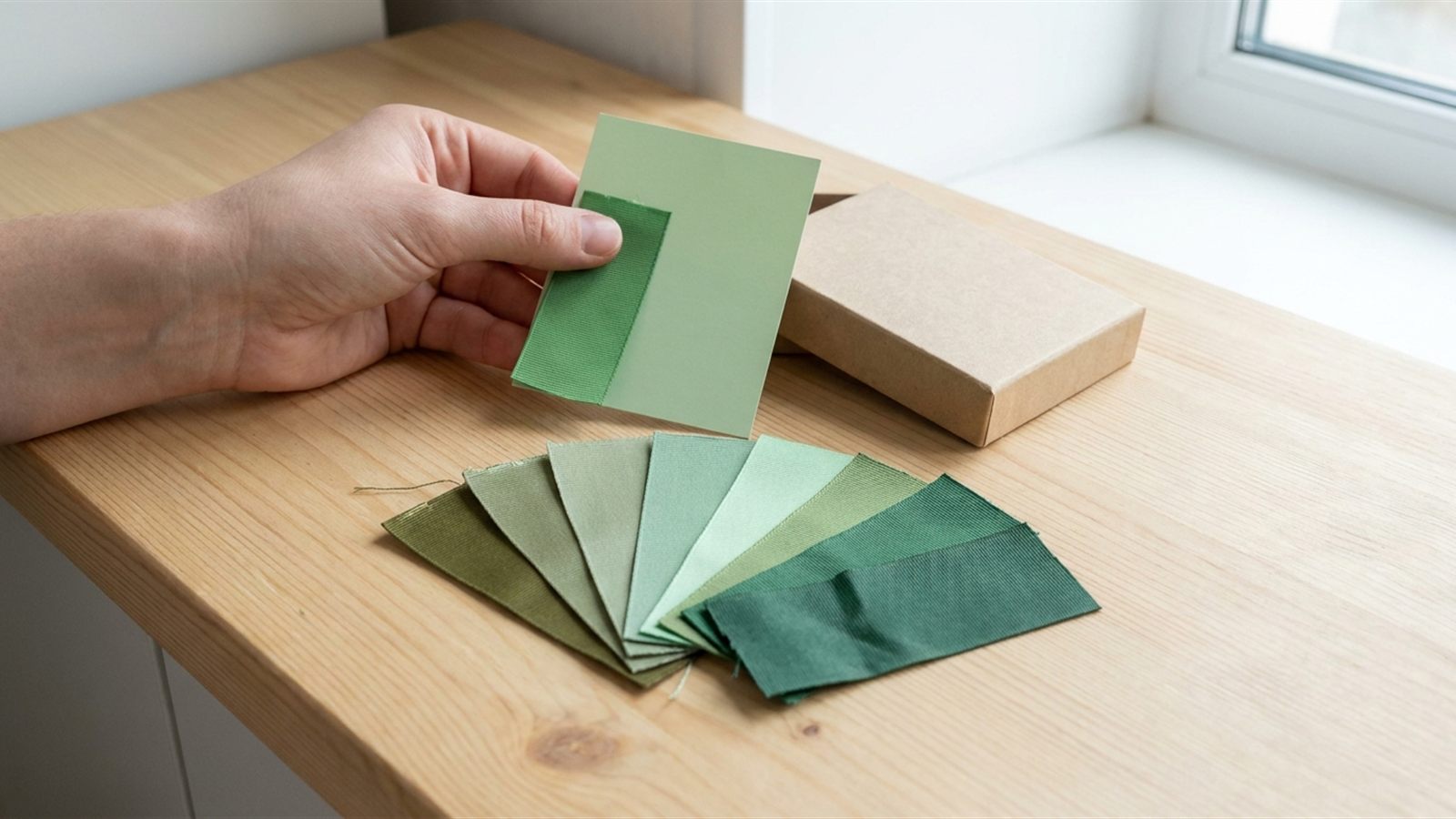
Why a photo lies
A photo of ribbon, sent on WhatsApp or viewed on a supplier's website, cannot be trusted as a colour reference. Several things shift the colour before it ever reaches your eye, and they shift differently on every device.
- The screen. A phone, a laptop and a shop display each render the same file slightly differently. Brightness, colour calibration and even the angle you hold a phone at all change how a shade reads.
- White balance. A camera guesses at the colour of the light in the room and corrects for it. Indoor bulbs, shade and direct sun all push that guess in a different direction, so the same ribbon can look warmer or cooler from one photo to the next, taken minutes apart.
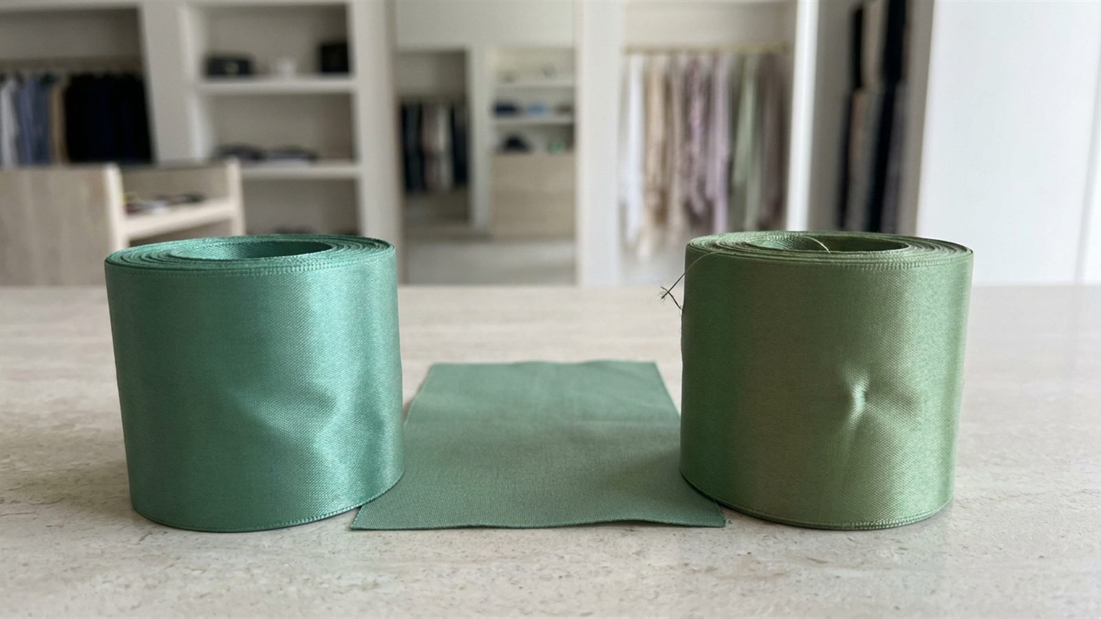
- Sheen on satin. Satin's shine bounces light back at the camera, and a bright highlight on a fold often reads as a paler shade than the ribbon actually is. A flat photo flattens a finish that is never flat in the hand.
- Metamerism. Two colours can match perfectly under one light and visibly disagree under another. A ribbon and a printed box lid dyed to the same reference can look identical under a shop's fluorescent tubes and then part ways next to a window. This is a real property of dyes and pigments, not a mistake in either material, so it needs checking rather than assuming away.
None of this is a fault in your phone or your supplier's camera. It is why colour approval has to move off the screen and onto something you can hold.
What a Pantone reference does and does not promise
Naming a colour by its Pantone number, rather than describing it in words, gives everyone a fixed reference instead of "our green", which means something different on every screen. That much is reliable, and it is worth doing for any colour that matters, as the logo-printed ribbon guide covers for artwork.
What it does not promise is an exact match on fabric. Pantone's familiar guides are built for coated and uncoated paper; Pantone also publishes a textile range (TCX) made for dyed fibre, and the two are not interchangeable. A coated-paper Pantone number and its nearest textile equivalent can sit close but not identical, because ink on paper and dye in fibre behave differently. Ask which reference your supplier is matching against, and treat the result as close rather than exact until you have seen it on the actual ribbon.
Asking for and judging a physical swatch
A swatch is the only honest way to approve a colour. How you look at it matters as much as asking for one.
- Check it in daylight. Indoor bulbs and shop lighting can flatter or distort a shade. Carry the swatch to a window or outside, away from direct glare, and look again.
- Put it beside the box. A colour that looks right on its own can clash or drift against the actual box, card stock or packaging it will sit on. Judge the pair, not the ribbon alone.
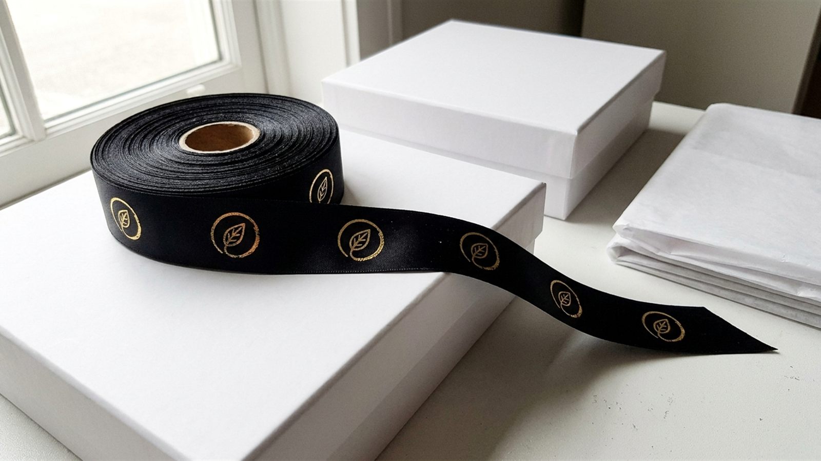
- Hold it next to the brand print. If the ribbon must match a logo, a label or printed artwork, compare it directly against a printed sample of that colour, not against a screen version of the logo.
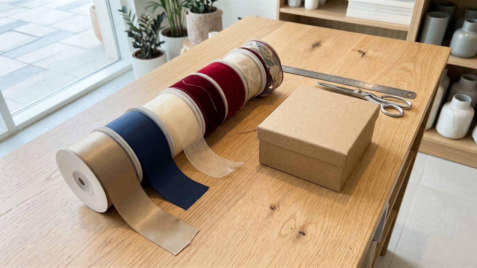
- Check it on the finish you will actually use. Colour shifts between finishes: a shade in satin, grosgrain and organza from the same dye reference can look like three different colours side by side, as the guide to ribbon finishes sets out. Approve the swatch in the finish going on the final order, not a convenient substitute.
- Look more than once. Check it in the morning and again later in the day if you can. A shade that passes under one light and fails under another is telling you something real about metamerism, not giving you a false alarm.
Dye lots and why re-orders drift
Ribbon dyed in a later batch can differ very slightly in shade from an earlier one, even against the same reference. This is a known property of dyeing, not a one-off error, and it shows up fastest when an old box and a new box sit side by side. A re-order will only match the first run if the colour reference and settings are kept on file and matched against, so ask about that before the first order, as the logo-printed ribbon guide also notes for printed ribbon.
Keep a reference cutting from every approved order: a short length of the ribbon, stored flat and out of direct light. It is the one comparison that does not depend on a screen, a memory or a supplier's own record, and it is what you hold up against the next batch.
How finish changes the same colour
"The same colour" is not one thing once it is woven into ribbon. Satin's sheen lifts highlights and can read paler or brighter under light; grosgrain's matte, ribbed surface absorbs more light and reads deeper and flatter; organza is thin and sheer, so the colour you see depends partly on what is behind or underneath it. A gold or a green chosen on one finish will not automatically look right carried onto another, so if a project uses more than one finish in the same colour, swatch and approve each finish separately rather than assuming the match carries over.
Matching to a box or a logo print
When ribbon has to match a printed box lid or a logo printed directly on the ribbon, compare the two physical items side by side, in daylight, before approving either. A box print and a ribbon dye are different processes on different materials, so even with the same reference number they can sit close rather than identical; decide in advance how close is close enough for the project, since "exact" is rarely realistic across two different materials. For a logo printed on the ribbon itself, the artwork and colour-naming steps in the logo-printed ribbon guide apply directly.
A step-by-step approval process
- Name the target colour by its Pantone reference where one exists, and confirm whether it is a coated, uncoated or textile (TCX) reference.
- Ask for a physical swatch in the actual finish, and in the actual width if the width is unusual.
- Check the swatch in daylight, beside the box or packaging it will sit on.
- Check it again next to a printed sample of any logo or brand colour it must match, not a screen version.
- Approve in writing, and ask for the approved colour reference and settings to be kept on file.
- Keep a reference cutting from the approved order for every future re-order to be checked against.
The short checklist
- Colour named by a Pantone reference, with coated, uncoated or textile (TCX) confirmed
- Physical swatch requested in the actual finish
- Swatch checked in daylight, beside the box and beside any brand print
- Match approved in writing, and the reference kept on file
- A reference cutting kept from the approved order, for every re-order to be checked against
Questions buyers ask
Why does ribbon look a different colour in a photo than in person?
Because the screen, the camera's white balance and the ribbon's own sheen all shift what the photo shows. A phone camera guesses at the colour of the room's light and corrects for it, which pushes the shade warmer or cooler depending on where the photo was taken, and satin's shine can make a fold look paler than the ribbon actually is. Always confirm a colour on a physical swatch, not a photo.
Does a Pantone number guarantee an exact ribbon colour?
No, it guarantees a fixed reference rather than an exact result on fabric. Pantone's familiar coated and uncoated guides are built for paper, while the textile (TCX) range is built for dyed fibre, and the two are not interchangeable. Naming a colour by Pantone number is far better than describing it in words, but ask which reference is being matched against and confirm the result on a physical swatch.
What is metamerism, and why does it matter for ribbon colour?
Metamerism is when two colours match under one light and visibly disagree under another, which is a real property of dyes and pigments, not an error. A ribbon and a printed box can look identical under a shop's fluorescent lights and then part ways next to a window. Check any colour match in daylight, and again at a different time of day if the project matters enough to warrant it.
Why does the same ribbon colour look different in satin and grosgrain?
Because the two finishes reflect light differently. Satin's sheen lifts highlights and can read paler or brighter, while grosgrain's matte, ribbed surface absorbs more light and reads deeper and flatter. A dye reference that looks right in one finish will not automatically look right in another, so swatch and approve each finish you plan to use separately, as the guide to ribbon finishes explains.
Will a re-order of ribbon match the first order's colour?
Only if the colour reference and settings from the first order are kept on file and matched against, because later dye batches can differ very slightly in shade even against the same reference. This shows up fastest when an old box and a new one sit side by side. Keep a reference cutting from every approved order, stored flat and out of direct light, to check the next batch against.
How should I check a ribbon swatch before approving it?
Check it in daylight, away from indoor bulbs and glare, and hold it next to the actual box, packaging or printed logo it must match rather than judging it alone. Check it on the finish that will actually be used in the final order, since colour shifts between satin, grosgrain and organza. If possible, look again at a different time of day before signing off.
Can ribbon be matched exactly to a printed box or logo?
Close, usually, but treat "exact" with caution, since a box print and a ribbon dye are different processes on different materials, even against the same colour reference. Compare the physical ribbon and the physical print side by side in daylight before approving. For a logo printed directly on the ribbon, the colour-naming and artwork steps in the logo-printed ribbon guide apply.